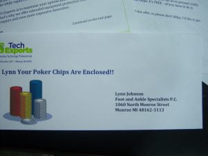
I have two schools of thought about envelopes.
If you’re mailing to a cold list, such as a purchased list, more times than not I’d suggest a plain white envelope, plain courier font, a real stamp, and no company name on the outside. This is called the sneak up approach.
The idea here is that you want to get your letter opened so the prospect can read it (see my posting about headlines). By not putting any information on the outside of the envelope that will identify it as VMM (valuable marketing mail), the prospect is more apt to open it.
If I’m mailing to a warmed up list, meaning a list that I’ve mailed to before, I’ll often try to use teaser copy on the outside of the envelope. Teaser copy can be as simple as another headline that will grab the prospects attention; it can also be a photograph or other graphics. The sole purpose of teaser copy is to get your letter opened. Here’s an example of some teaser copy we used recently, and the response to this mailing was awesome:
Steve, I recently took one of my best clients out to lunch. I had no idea our pleasant conversation would make this grown man almost burst into tears!
If you’re going to use teaser copy, devote as much time and effort to the teaser copy on the envelope as you did the headline of your letter.
We have also had a lot of success with colored envelopes. Bright yellow, pink, blue, and neon green have all pulled well for us. I’ve been lucky to find large quantities of close out colored envelopes on E-Bay.
Odd size envelopes will increase response. They stand out from the other mail.
Two final thoughts:
1. As a rule, teaser copy works better to consumers than it does to business prospects. Secretaries and office assistants are sometimes asked to toss all mail that looks like advertising mail. However, when a teaser is "right on" it can be incredibly effective at getting your mail opened. It is worthwhile to test teaser copy on business mailings, as it can outpull a plain envelope if its powerful and compelling.
2. NEVER USE LABELS ON YOUR MARKETING MAIL.
Seriously, never. It screams junk mail.]]>
Direct Mail
Headlines, headlines, headlines!
 Always use a headline at the top of your sales letter.
Never use a company logo or your name and address at the top of a sales letter.
It is a “me” message and decreases response.
Use a logo at the bottom of your letter, or on the last page.
The exception: If you’re writing to an audience that would be positively influenced by your name or credentials.
Spend up to 80% of your time on a sales campaign writing the headline, or if you’re doing an e-mail campaign, the subject line.
Reason? Potential clients won’t bother to read your letter or e-mail unless your headline/subject line is AMAZING.
Tips for using pictures in your marketing

Use a caption under every photo you use in your advertising. They eye is drawn to a picture, and the area under a picture is one of the most read pieces of copy on the page. I like to make the caption interesting.
Instead of “Thomas Fox, President, Tech Experts” I might use “Tom Fox, Small Business Support Guru and President of Tech Experts.”
Try to make your photo(s) tie into the headline and copy. For highest response, always use people rather than objects in your pictures. And if you can work it in somehow, pictures of children are big attention-getters. I’ve also had a lot of success using my dogs.
In photos of people, make sure they’re looking directly into the camera. Eye contact with the reader is a good involvement strategy.
Crop your photos, especially if you took them yourself, or a client provided them. Cut out space over head or to the sides, that isn’t integral to the subject matter. No one wants to see a picture where the top half is the sky.
Remember, a picture is worth a thousand words!